SIMPLY. Logistic Systems GmbH

Simply Perfectly Coordinated
SIMPLY. Logistik GmbH, a medium-sized company that develops and distributes systems for material handling as well as automated container loading, faced no small number of challenges when they approached me with a request to redesign their website.
In our first conversation, we immediately identified the pain points. The previous website was slow, outdated in design and cumbersome to use. Our goal was to create a new website that would be as fast and simple as the company’s flagship product, the SIMPLY.,and I wanted to bring in ideas and new approaches. I also wanted to come up with ideas and new approaches to make the website more attractive to potential customers.
By analysing the questionnaire that the SIMPLY. team filled in, I discovered other critical points. The most important was to communicate the advantages and added value of their products simply, clearly and quickly, as the existing website was confusing and contained complex texts. There was a risk that potential prospects would not find the products or perceive the website as too complicated and bail out.
The solution started with competitive research and a design draft of the site.
I rebuilt the site from the ground up to solve the speed issues and use only the most essential elements.
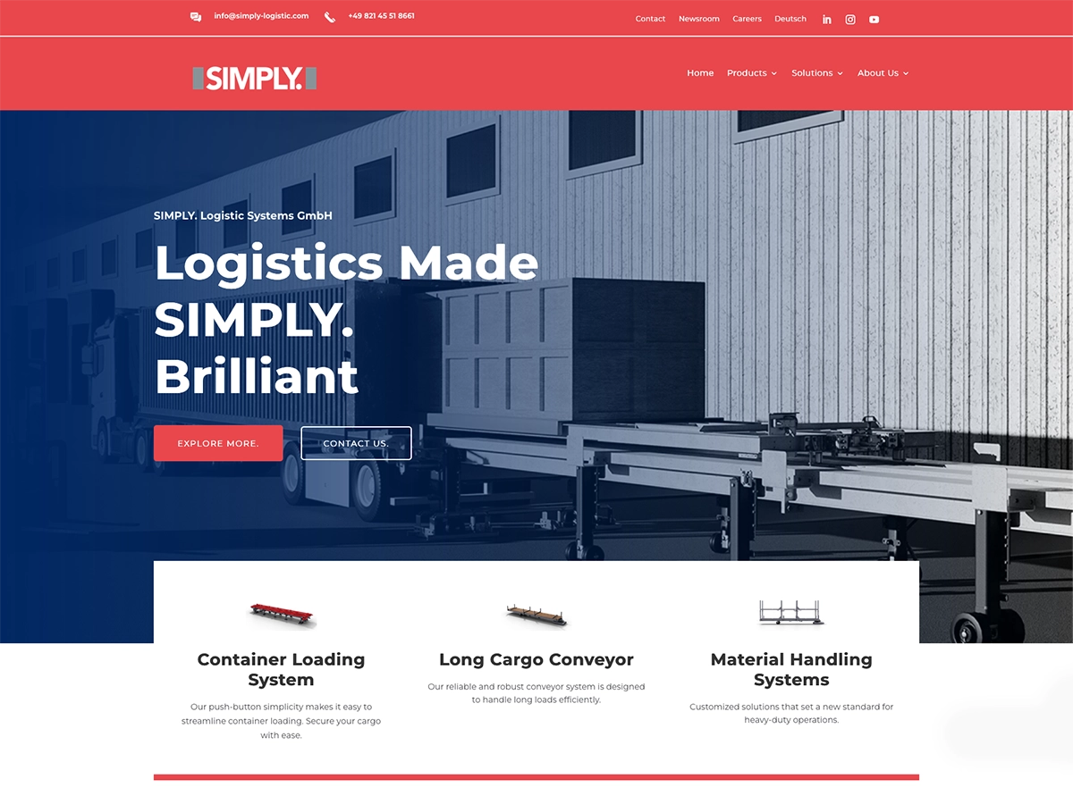
On the main page, the three product categories are now visible from the start, the footer and header have been redesigned and expanded with the most important links and contact information for quick navigation, and not only the products should be visible, but also the success stories of customers who have used SIMPLY. systems. These success stories were also strategically integrated into the pages, as were customer reviews of the main SIMPLY. system.
As many customers came through paid advertising, referrals and trade show visits, I also intensified SEO activities to increase visibility and created four more subpages to target specific industries that could benefit from SIMPLY. solutions. SEO will be further developed in the coming months by integrating text into images and highlighting specific keywords in blog posts.
An enhanced contact form has been customised to meet the needs of the team.
A newsletter function was also integrated to send important messages to interested parties.
Images were strategically placed to enhance the user experience, and a 3D designer was brought in from the UK to create product visuals, which have the advantage over photos of reducing visual distractions and focusing on the essentials.
Similarly, all tables have been redesigned to better display product data and make it easier for customers to compare different options.
The use of marketing language has been limited to call-to-action banners and the contact form area. The language has been simplified to be understandable to executives in different industries and to speak directly to them about the benefits of the products.
Overall, I optimised the design methods for the benefit of the company.
The usability has been improved and simplified, the brand identity has been unified, information is now reliably delivered to potential prospects and the team can handle enquiries more efficiently, because successful design is invisible and therefore difficult to spot at first glance.
All of the SIMPLY. team’s wishes were met and the result is a website that perfectly matches the company’s business. The website now reflects SIMPLY.’s products – appealing, fast and simple.
Website: simply-logistic.com

Before & After Comparison
For comparison, I have attached an extract from the home page of the old website. You can see the huge difference, especially the user-friendliness and customer approach has improved many times over.
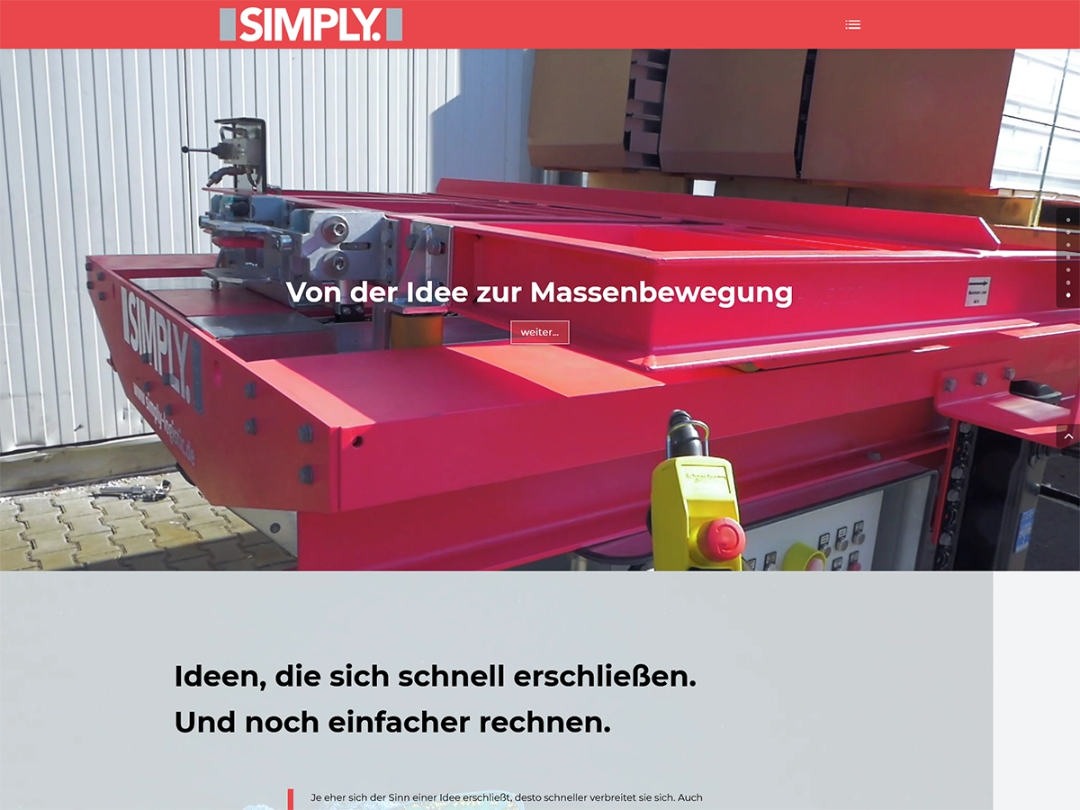
Before
The website of SIMPLY. Logistic Systems needed an update. The company sells successful products that are modern, fast and reliable. The new website should also meet these requirements. This means that the website should reflect the company’s products – quickly and simply.
After
The foundations for the new website have been laid. This makes the site much faster and more reliable. This meets the first requirement. The second requirement, simplicity, has been achieved by focusing on user-friendliness. The language has become more direct and the products and navigation are recognisable at first glance..
These innovations are crucial to presenting yourself as a successful business. A business that can become a bestseller.